Art On Clark is an art walk located in Chicago’s Lincoln Park neighborhood. Now in its 4th year, the Lincoln Park Chamber of commerce tasked me with updating the logo for this annual art walk, which would be included in brochures and marketing for the event. The chamber was very open in terms of the design, with very limited needs in terms of imagery outside of something clean and something that spoke to the art on display, all of which is sculpture based public work.
Here are the initial designs based on the initial criteria: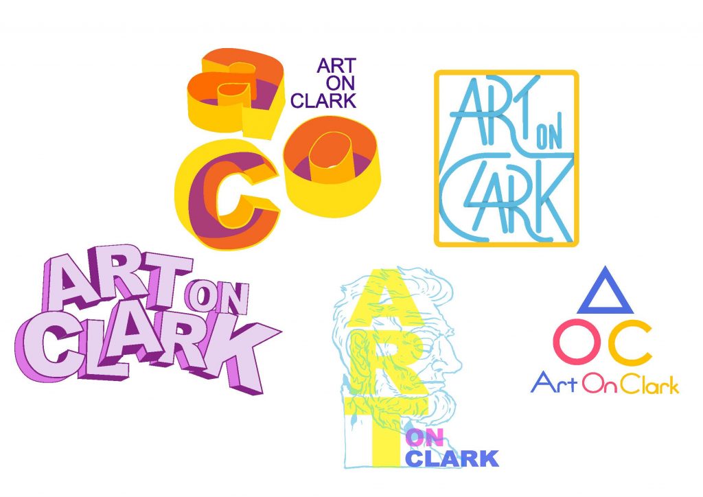
I really swung wide with these designs, trying to provide a very wide range of feeling. I was very focused on communicating art, sculpture and an eye catching color scheme. Ultimately the very simple design on the lower right hand side came closest to what they were looking for as a jumping off point of the rest of the project.
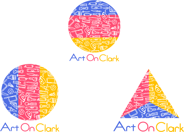
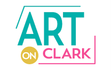
 From this design I created three more logos, incorporating the primary color scheme and the badge stacked format, but also adding hand drawn sculpture tool icons to give them texture.
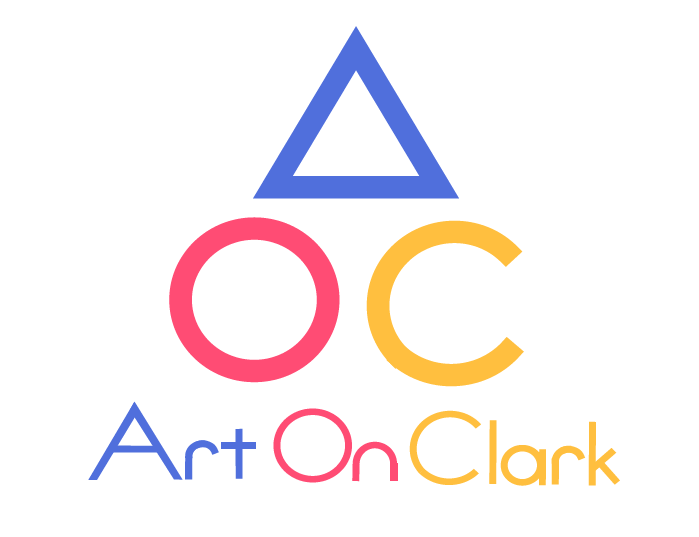
At this point they felt that the design was a little too specific and less about the event, and about the art itself. So the chamber went back to the initial set of designs and asked to take the primary color logo and combine them with this more art deco badge design.
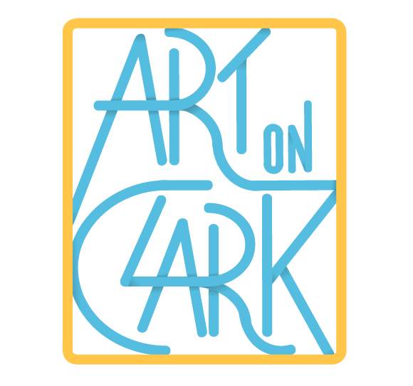
The end result was this simplified badge, incorporating the line work of the art deco badge and cool versions of the primary color scheme of the stacked design.
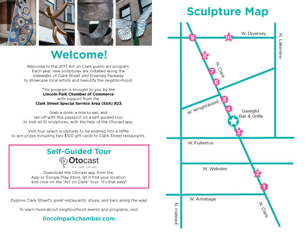
This color scheme would provide the template for the rest of the project deliverables, as an example here is the outside and inside of a map and “passport” for the event.